Launched Overnight Websites

Take a look at some previous Overnight Websites that we’ve been able to bring online quickly and easily.

While we do link to some of the sites, keep in mind that they could change at any time. We do build our sites to last, but we don’t always have control over what happens to the site after it’s out of our hands.

Neon computer with icons and a website wireframe and a yellow neon spaceship circling the outside along a blue neon outline.

TCW Strategies

A progressive values-driven data analytics and strategic consulting firm wanted a full site to replace their existing one-page site.

The main goal was adding mailing list subscribers, with the focus on introducing the firm, their services, and the people behind it. They also wanted to start adding blog posts to the site.

We created five custom mobile-optimized, easy-to-update pages and the ability to easily create blog posts with a callout box. There’s also an integration with the SendInBlue email platform.

You can take a look at the live TCW Strategies site or view the home page and about page screenshots.
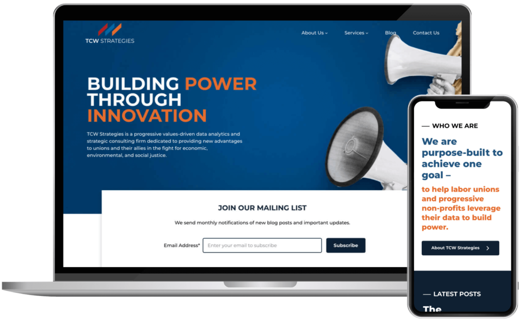
The top of the home page for the TCW Strategies website shown on a MacBook and the home page scrolled down a bit shown on an iPhone.
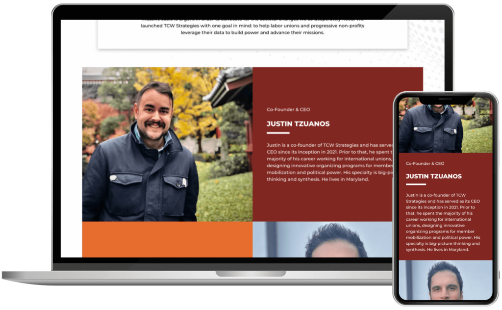
The about page for the TCW Strategies website scrolled down a bit shown on a MacBook and the same section shown on an iPhone.

Engage Every Student

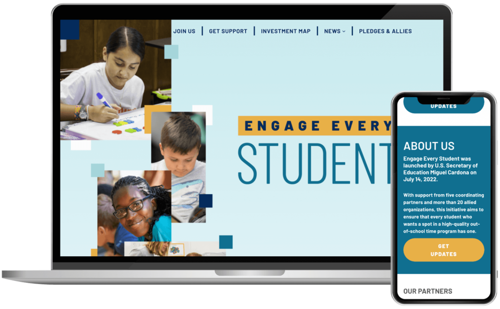
This is the organization behind an initiative to provide high-quality out-of-school time to every student who wants it. They needed a website to introduce it to the world.

The main goal was presenting information about the initiative in a way that wasn’t too overwhelming and allowed people to find the type of information they needed.

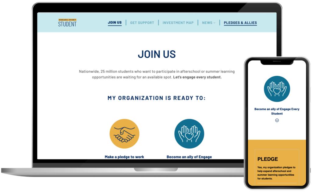
We created five custom mobile-optimized, easy-to-update pages and the ability to easily create blog posts. The site also includes a way to add multiple accessible accordions to any page easily. We also integrated two external forms that were already built on their existing form platform.

Since launching, we have updated the logo, colors, and some site elements and added new pages.

You can take a look at the live Engage Every Student site or view the home page and join us page screenshots.

The top of the home page for the Engage Every Student website shown on a MacBook and the home page scrolled down a bit shown on an iPhone.
The top of the join us page for the Engage Every Student website shown on a MacBook and the same page scrolled down a bit shown on an iPhone.

Soaring Heart Center

A values-based and impact-driven therapy practice wanted a full site to replace their existing basic site. They wanted a site that better reflected their brand.

The main goal was to increase conversions and add mailing list subscribers.

Each team member page has its own form to notify the correct team member and the contact page allows someone to choose who to notify.

A few months later, we connected an LMS and ecommerce solution that added the ability for them to sell and distribute their course.

You can take a look at the live Soaring Hearts site or view the internal page and team member page screenshots.
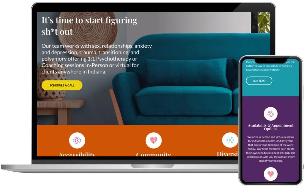
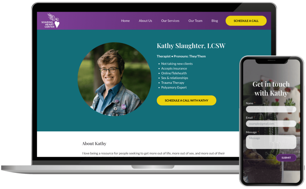
The top of a page for the Soaring Heart Center website shown on a MacBook and the page scrolled down a bit shown on an iPhone.
The top of a team member page for the Soaring Heart Center website shown on a MacBook and the page scrolled down a bit shown on an iPhone.

Jessica Darby Photography

Wisconsin’s premier equestrian photographer wanted a full site to replace their existing basic site.

The main goal was to provide an easy way to showcase their services in an easy-to-understand way and increase newsletter signups.

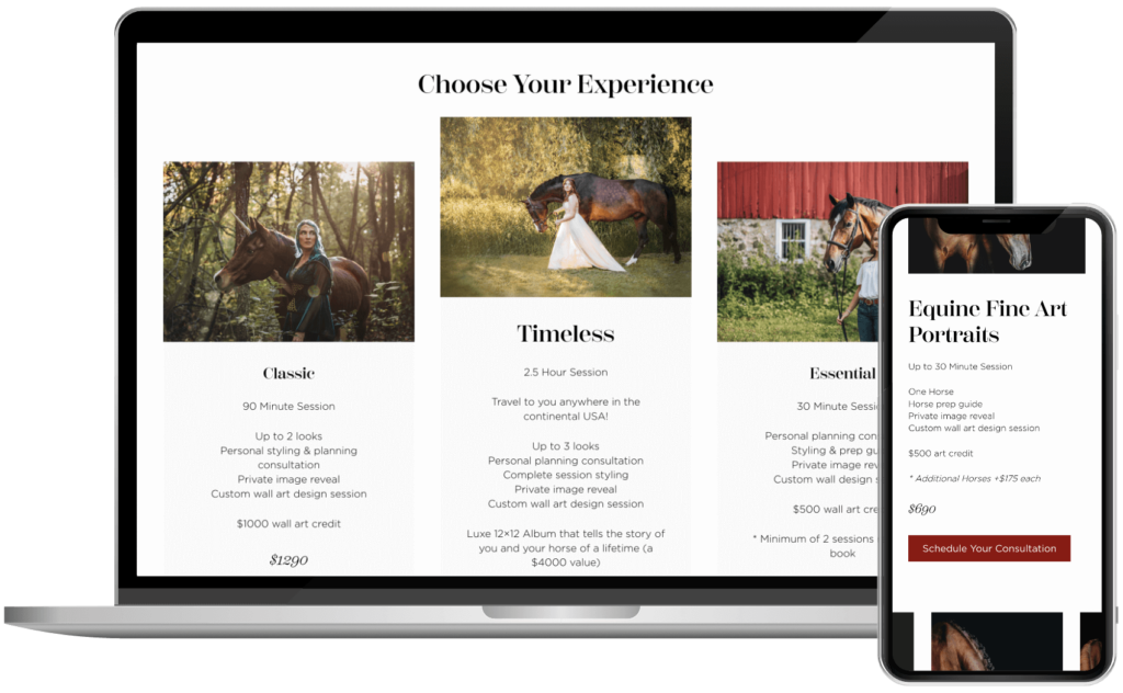
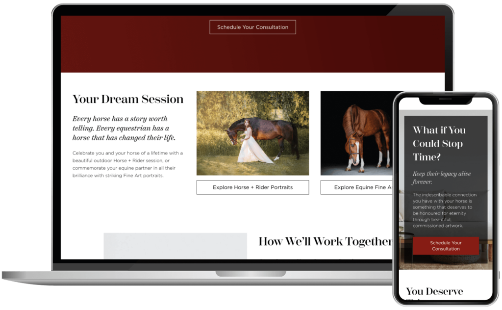
We created a collection of independent block patterns that could be added to any page on the site and easily adjusted to give variety within the design guidelines. There’s also a custom form design and custom button hover effect. There are also a few synced patterns to make updating things like upcoming destinations is easy.

You can take a look at the live Jessica Darby Photography site or view the internal page screenshots.

The column section of a page for the Jessica Darby Photography website shown on a MacBook and a different section of the page scrolled down a bit shown on an iPhone.
The other column section of a page for the Jessica Darby Photography website shown on a MacBook and a background image section of the page scrolled down a bit shown on an iPhone.
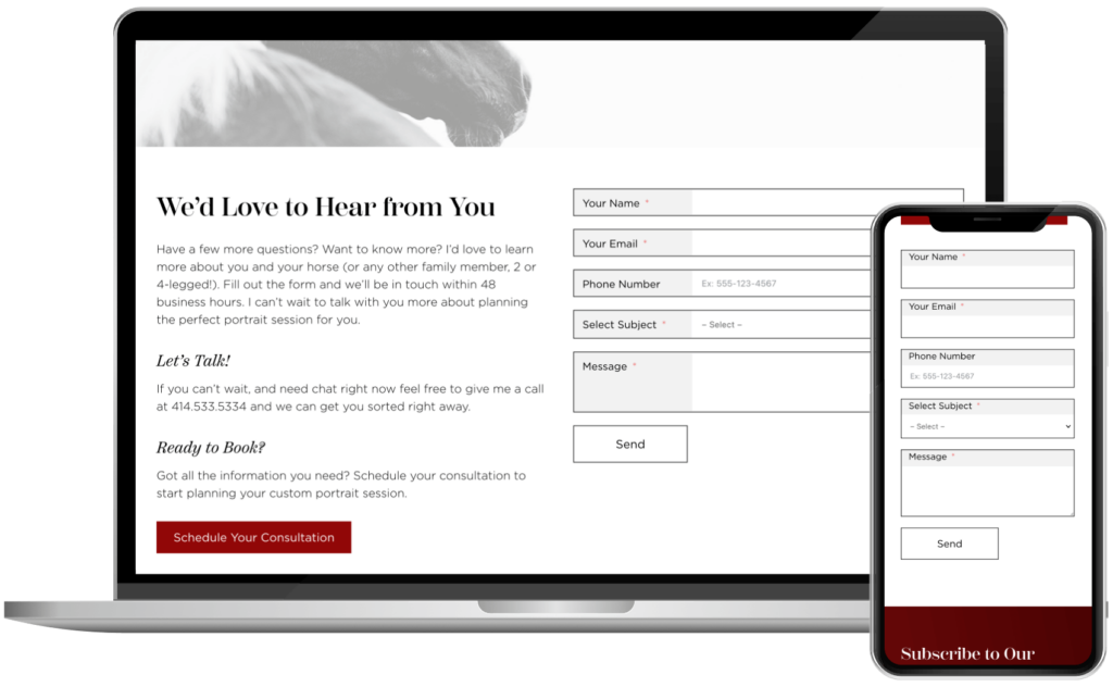
The contact page for the Jessica Darby Photography website shown on a MacBook and a the page scrolled down a bit shown on an iPhone.

Impact Scaling School

A business coaching program that helps business owners scale wanted a new, streamlined site to replace their outdated existing site.

The main goal was to give some information on the program and to get qualified people to schedule a call.

It was originally a one-page site, but we ended up adding a team page to give people an idea of who they’d be working with. We added a “book a call” button and an embedded scheduler to work with their already-established system.

You can take a look at the live Impact Scaling School site or view the home page and team page screenshots.
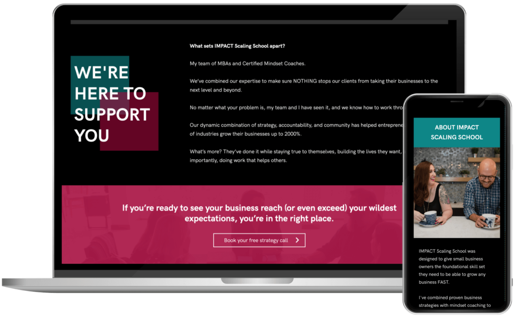
The about page for the Impact Scaling School website scrolled down a bit shown on a MacBook and an additional section on the same page shown on an iPhone.
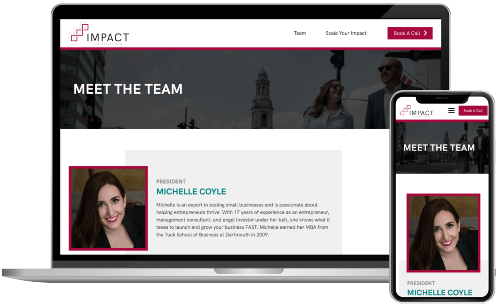
The top of the team page for the Impact Scaling School website shown on a MacBook and the same section shown on an iPhone.

Like what you see? Thinking about getting your own Overnight Website?