You can also listen to the audio version of this on the podcast.
Transcript
Note: I’ve included some relevant screenshots. Headings correspond to the video chapters.
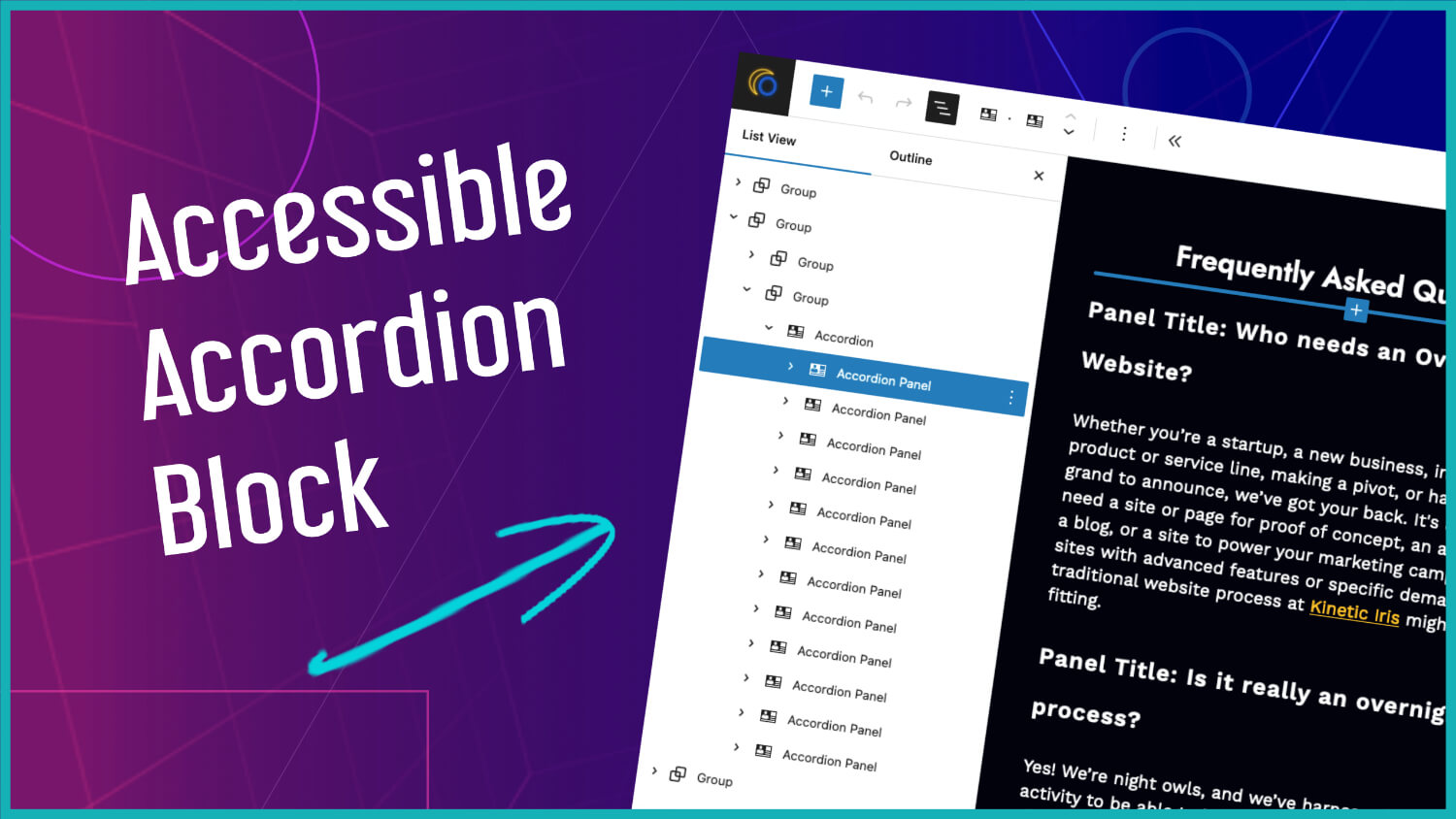
Let’s talk about accordians. It’s something that a lot of different page builders and website platforms all offer as something that you can add to your website. But it’s something that’s a little bit harder to test for. There’s a lot of moving parts and a lot of components, so it’s a lot harder to check if this accordion that something is offering you is actually accessible or not.
When I launched the Overnight Website website, I built an accordion and put it on on the site. It was accessible to my understanding at the time, and it was accessible at least to the point that everyone could get that information. But it wasn’t fully accessible and optimized to provide a similar browsing experience for everyone who used the site no matter how they consumed the information.
I ended up building an accessible accordion for another project so it was something that I had revisited, and I wanted to make sure that I applied that new knowledge to my own site now that I had the markup and knew how to do it. There are a bunch of different posts and walkthroughs and explanations out there for accordians but because this involves a little bit of JavaScript, I found those situations are some of the harder ones to not only get right but to just get it to work in the first place.
There’s a bunch of different ways to do things which complicates matters and so taking an example that’s like in a blog post that’s, it’s code, and making it actually function takes a little bit of finesse and trial and error, and getting this to actually function was something that I not only wanted to get right I wanted to be able to take it and apply it to future projects as well, so I wanted to share how I did this in order to have one place for people to go that combined all of that investigation I’ve already done and hopefully make the process a little bit easier to implement as well.
Initial Approach
Some people tend to turn everything into a custom post types as often as possible and so with some builders and and some tools it can be really easy to then take that, pull that data into the page through loops or queries, there’s a Query Loop Extended block that does the same thing for the native builder, and that approach gives you some of that flexibility. It lets you categorize things, show things conditionally, organize them. You’re simplifying the data entry, manipulating them to be able to show you know a custom template for them.
So if it’s something that you plan on using throughout your site on more than one page, something shown based on their category, that could be the right approach. Something that you’re going to click on and then go through to another page, that’s definitely a place where you would use those custom post types. There’s also an argument for keeping the data and the presentation separate. So all of these arguments are in favor of that custom post type.
If you’re not going to need any of those things but you’re not sure if it’ll happen at some point, that’s up to you how to handle it, because there’s no right answer here unless you specifically have plans for future implementation. So in the case where you’re not sure, I figured for FAQs it might be helpful to have categories. I can show different FAQs based on the page, I can apply one FAQ in multiple places so that when I had to update it I only had to update it in one place. I didn’t have to remember where it was or check all of them. I was able to see it, update it all in one place.
There are a few drawbacks with this scenario. If a custom post type shouldn’t be accessed directly, you’re going to have to account for that. It’s not hard or complicated, it’s just something to consider. If they can’t access the categories directly, that’s something to consider as well. I also wanted a specific order to the FAQs, so I had to install a plugin to make that easier to visualize and change the order of them. That also meant if I wanted a different order order for a different page, that was going to be difficult as well. I’d have to call them individually on the page so that at least they’re dynamic and I’m not duplicating the custom post type which would defeat the purpose completely.
The benefit of starting out with the custom post type is that if you want to expand it or change it, you’re not going to have to re-enter data. If you start off with items on your page and then you want them to be a custom post type, you’re then taking that data and migrating, but if you start with a custom post type and realize you don’t need that custom post type anymore and you want to simplify things, you’re then migrating data in the reverse way which is what I ended up having to do.
So I had started out the FAQ accordion with a custom post type with each question entered as the title and the content entered in the content area and then a simple Advanced Custom Fields custom block that was basically just category selection. So I did everything else through that ACF Block code. It was literally just a box with a drop down, select the category for FAQs.
New Approach
When I decided I wanted to redo the code to be more accessible, I decided to approach it using a nested block method instead. So all the drawbacks that I listed and all of the positives for a custom post type really made it not a great fit for my use case.
As a side note, why didn’t I just use the details block. There’s a block in WordPress that they make available to you for details, but an accordion is not really the intended use. A details block is for things like a transcript or a summary. Each one would be independent of each other and they’re not part of an overall accordion, so they don’t get read out in the same way and they don’t have the same markup.
The Custom Accordion Block
So let’s dive into the custom accordion block.
So real quick just so we know what we’re looking at, this is going to be the accordion.
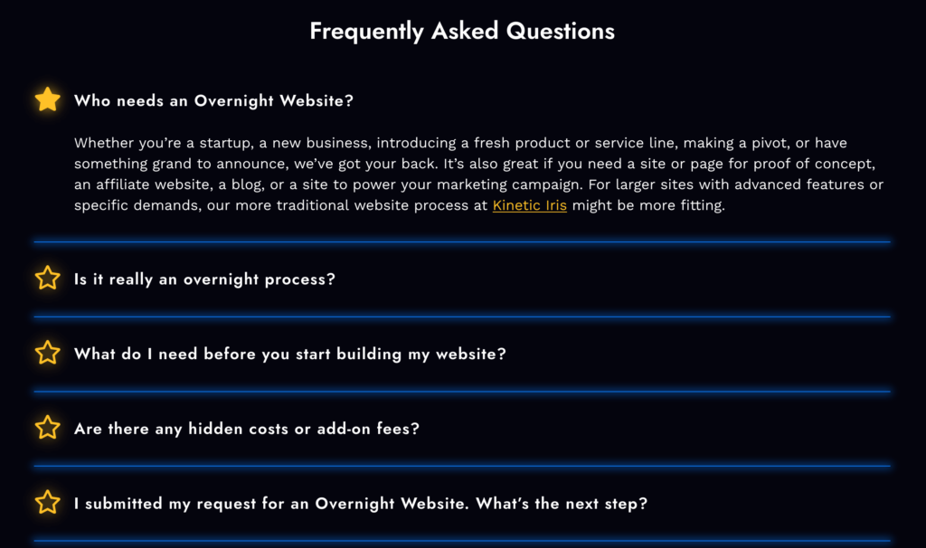
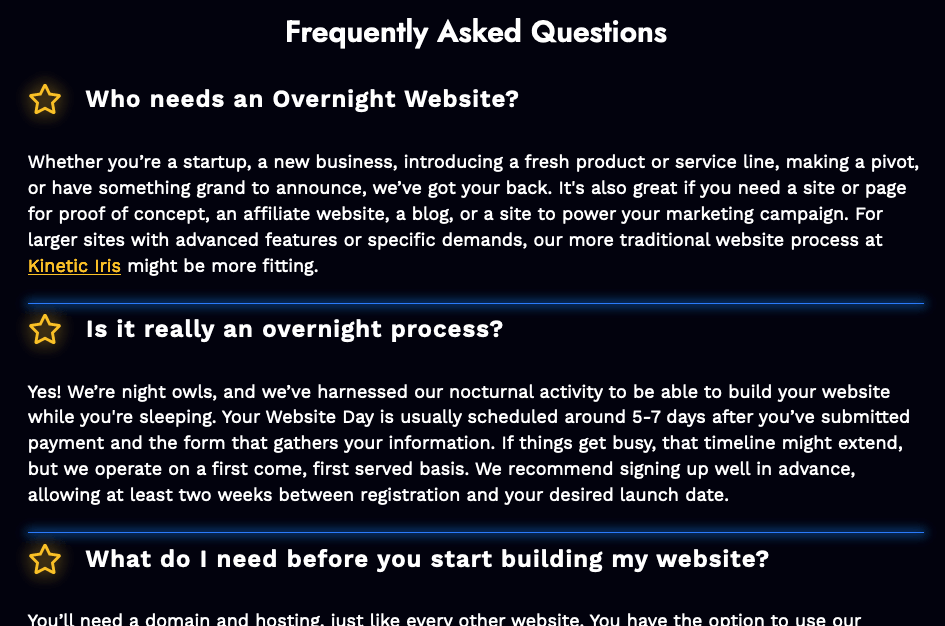
I have it stylized so that it fits in with my overall brand but basically I have a title that says frequently asked questions and then a bunch of questions that have a star indicator when I click on it or open it, the star gets filled in when I hover over the clickable item the star changes to blue with an underline over the title and then the text is pretty simple text with a possible link in it but really maybe a list but it’s pretty simple just regular content.
And then if we take a look at the editor itself I have the accordion block with a bunch of accordion panels inside of it with a paragraph pretty much in each one.
The other thing that we’re going to be looking at is the Advanced Custom Fields field group.
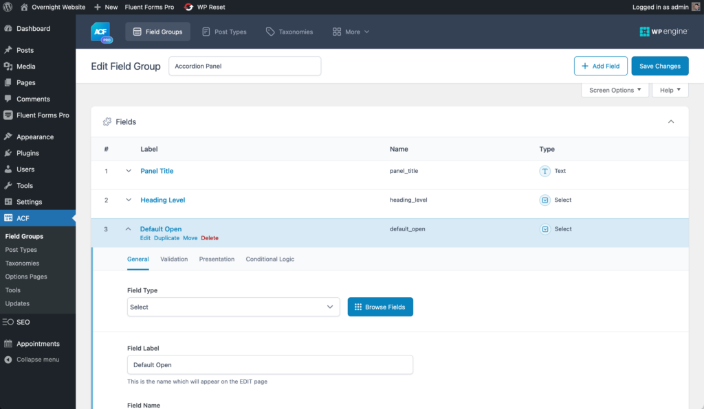
We have three different fields in here, a panel title, a heading level, and whether I want it to be default open or not with various options. And so just so we know what we’re looking at that’s a really brief overview of what we’re going to be looking at and when we’re diving into the code those are the things that that we’ll be talking about and referencing.
Introduction to the Code
So looking at the code which you can find on GitHub. I’ll share a link to this in the comments of the the video on YouTube. I’ll also read it out for you currently the link is so that’s where I have the the GitHub repo for you to follow along with and download if you’d like. https://github.com/queerdevperson/ow-accordion
So if we head into our code I have open Visual Studio code and then we have our repo contents over on the left side. I’ve included a ACF export file so that you can just go ahead and import those fields that I have and it does require Advanced Custom Fields Pro in order to create a custom block. If you don’t want to make the block and you want something simple like I had said originally you can go ahead and just create a regular shortcode with something like this so that you’re at least still using the accordion code. That’s fine, you can follow along but a lot of what I’m going to do is based on Advanced Custom Fields Pro.
This would all go into a plugin ideally, since this is core functionality. Right now I just have things inside of a functions.php because I don’t know how you’re going to be setting things up, I just sort of threw this together based on what I’ve created. So obviously the next step in this would be to create a plugin for this that would obviously require Advanced Custom Fields Pro.
The Basic Functions
There are a few things in here that you can throw into your theme or your child theme in the meantime in order to then turn this hopefully eventually into a plugin so that we’re keeping the functionality separate. If you decide to change your theme your accordion is still going to be there and still work.
Inside the functions.php there’s really only two things. The first function in our functions.php are, it’s basically just registering our overall accordian parent and then our accordion panel so I’m just registering those two things in the init. And then we have a second item that is basically enqueueing the Javascript file that we have, and so rather than load it on every page whether there’s an accordion or not, I’m basically just checking if the page has our parent accordion then I’m loading this script into the page.
block.json
If we move into the blocks themselves there’s the standard block.json that you can read about in the ACF documentation but the thing to call out here is the parent definition on the right file.
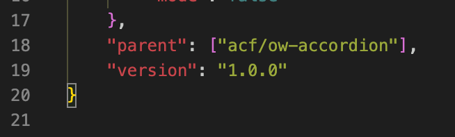
That’s the one in our child and we’re letting it know which one our parent is.
Parent Block Markup
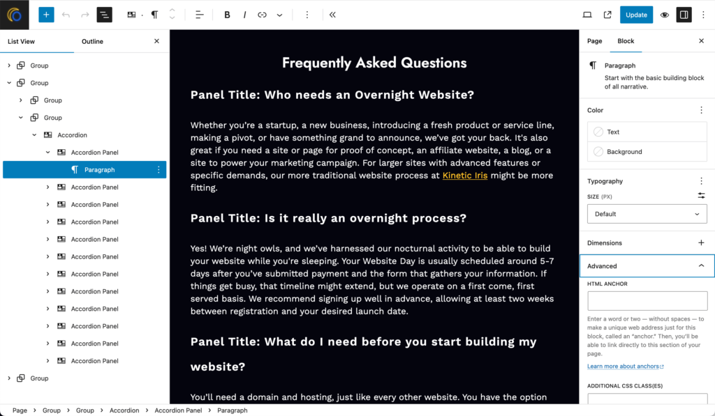
For the block markup in the parent block I have a couple of links in the top comments which is where I got the bulk of the information for this from and so that you can take a look at those and reference what you need to. The first thing we’re doing in this file is grabbing the anchor value and if we take a look really quickly over at the the page itself, all of these items, our parent block, our child block, even our individual items inside of each panel you can identify on the right panel under Advanced, our HTML anchor, and so that basically should be a unique ID that you’re giving to these things. But in our case we need a unique ID. If you enter one great but if not I do need something there. So that’s what we’re doing here where if it’s not set I’m defining um a custom anchor.
And then something that we’re going to be doing quite a bit here is determining whether we’re on the front end or the back end, and so is_preview, I have listed in the comments at the top, that’s something that ACF gives us access to as a variable, and so what we’re doing is if we’re on the front end then we want to display our wrapper, and our wrapper is basically going to be our custom ID with a prefix that I’ve added as well as a general class that we can use in our styles.
And then we can add in our inner blocks. And then what we do inside of this element is we want to only have panels inside of here so I’m defining that allowed blocks are only our accordion panel blocks and then the template that we want to use when somebody first adds this to the page is going to also be just a single panel element so that it’s not empty so you don’t have to go through having to add that first one. And then we close up our wrapper div if we’re on the front end.
Child Block Markup
For the block markup in the the panel block, there’s going to be the markup in here for each individual item inside that main accordion wrapper, and then so what we do at the top is grab those Advanced Custom Fields values that we looked at before. So we just have a title, a heading level, and whether I want it to default to open or not. The default value on that for ACF is no.
Sometimes the project requires the first accordion item to be open, and so I’m just enabling you to be able to do that if you needed to. The heading level, it should still follow the correct HTML heading level order, so it’s defaulting to the H3 but you’re going to want to pick the right one for your content situation, and so it’s enabling you to still stay within that accessible heading level.
And then we’re doing the same thing where we’re getting our anchor value if it exists and if not we’re going to generate a unique one, and then just like the parent block if we’re on the front ends then we show our wrapper.
And then if we take a look really quickly back at the admin it looks a little different than the front end. We have everything kind of just out in the open, ready for you to edit. We can edit the the title, heading level, and default open over on our right panel and then we can edit our content right within the block editor. And so I made this choice specifically because I felt that this was a better editing experience. A lot of times you’re either adding in a bunch of FAQs or you need to go in real quickly and edit some content, you don’t want to have to be clicking around to a bunch of things. The idea is to keep things nice simple and easy to update.
There are a few things that I could do to improve this, I could make it appear a little bit closer to the front end. I can have that star, I can put a box around this so you know that this is contained within the panel, there are some things user experience-wise that I can do to make it feel more like a similar environment. But overall I wanted this approach where we’re just listing out the title and the content, and so in our code you can see that reflected here by checking if we’re on the front end then I’m going to spit out my title that is a button wrapped in a heading.
I’ve then wrapped it in a div, that’s a choice, you don’t have to have it wrapped in a div. I wanted to be able to do some additional styling. But basically you need that heading with our custom heading level and then a button with a bunch of attributes which I’ll go into detail in a bit. I’m going to do the overall structure here and then we’ll go into each individual element.
And then so if we’re not on the front end I just want to display the title because you don’t edit the title right in the block editor. I wanted it to say “panel title:” and then spit out the panel title so that you can edit that in its proper box. If we’re on the front end, we’re going to show a wrapper div for our panel content, that is required, and then we’re going to show the inner blocks. If nothing’s added, if we’re just adding a new one to the page, what we’re going to show is that inner block template that we defined above which is just an empty paragraph, so you’re ready to just start typing or pasting or whatever it is. I wanted to add in a blank paragraph, it makes things a little bit easier when you’re editing. And then if we’re on the front end we close our two divs.
And so that’s our basic HTML structure.
If we head over to the browser tools, the developer tools, just really quickly to take a look at what this looks like, we have our wrapper that we’ve displayed in our parent, then we have the — ACF adds an inner blocks container, then we have our individual items. So inside of that we have our panel title which we’ve added our wrapper to, we have our heading which is the heading level that I’ve selected, and then we have our button inside of that, and then I have my little star in here as well as the title. And that’s how it looks inside the panel, too. We have our panel wrapper, we have the panel content, and then whatever blocks I’ve added inside of there.
So it’s pretty straightforward as far as the HTML is concerned. So let’s head back to our code.
Each of the attributes on both the button that’s inside our heading and our panel wrapper div, they have attributes that are going to complement and reference each other, and so these are the two things that you need to pay the most attention to. So first in our button we have an ID, we have an attribute that I I’ve called data-id, we have our aria-controls and aria-expanded, and so those are the four things on the button to pay attention to. And so for the id I’ve given it a prefix and then our anchor value, so I’ve called it button-anchor, for our data-id that’s just the anchor value, no prefix, for the aria-controls, the aria-controls meaning when I click on this what is this controlling? So you’re telling it what should I be moving in relation to this.
And so if we highlight it we can see a little bit further down that the aria-controls value is equal to the ID of our panel, and so I’ve called that accordion-panel-anchor and then under aira-expanded, if we’ve told it that we want it default open then we’re going to set it to true and then if not, which is going to be most cases, then it’ll be set to false.
And then inside our panel wrapper the attributes that we have on this div are role, ID, aira-labelledby, and then any classes that we want to add. So our role is region, the ID is accordion-panel-anchor and again that is the value of the aria-controls of our button and then the aria-labelledby, this means for this panel which element is telling me about this. And then so our aria-labeled by is going to be the button-anchor which is the ID of our button.
So you can see how these two elements are talking to each other. And then our classes, I’ve given it just a general class and then again we’re checking if this is open or closed and if it’s closed then we’re showing a hidden class.
And then if we pop back really quickly to the developer tools, as I open and close these items, the classes and the attributes then change their values as well, and so we’re going to be doing that through our JavaScript.
Important Styles
Really quickly just to go over the styles I’ve put all the styles inside the parent block. You’ll see there isn’t anything inside of the panel styles. That’s a choice that I made in order to keep everything streamlined. You can’t have the panel without the parent so I wanted to keep all the styles for these elements together.
The main thing to pay attention to here is those hover and and focus styles, those are the things that are going to tell people that something is clickable, it’s going to tell them when it’s open, and it’s going to change things when somebody tabs over to it, so those are the most important styles to pay attention to, as well as that utility class at the top to to hide things if we’re not showing it.
The Javascript
And then the only thing left to do is to take a look at our JavaScript.
At the top really quickly I have a note about a progressive enhancement. If you’re utilizing a no JavaScript class, you’re going to want to make sure that when you have things hidden that you’re applying it only to things that don’t have that you know no JavaScript class otherwise you want it to be a display block.
So diving into our JavaScript we’re looking for first all of the buttons that are inside of a heading level inside of our accordion container. So on the off chance that there’s a random button somewhere that does something, we’re only going to target the buttons that are inside of our headings that are inside of our overall containers. And so what we do is we add that event listener to it so on click we’re going to set the element that we’ve clicked on aria-expanded equal to true.
So what I’ve done is added two different functions. We have code that gets executed when we want to show an accordion panel and we have code for when we want to hide an accordion panel. So whether we’re showing or hiding an accordion panel we’re going to grab our three elements.
The first is the item that we’ve clicked on, we’re going to grab that non-prefixed ID and we’re going to get our wrapper and our panel based on that. So our overall accordion item that houses the title and the panel, and then we’re getting our individual panel. And so with those three variables I have some code in here that I’ve commented out.
I strongly prefer as a user to determine when something opens or closes. So if I come across an accordion a lot of times if there aren’t too many items I’ll just open them all and then this way as I’m reading it I’ll close them so I can keep track of where I am, or I’ll do it in the reverse where I’ll open them and then not close them as I’m reading so that I can keep track of where I left off, all the ones I read, especially because a lot of times the FAQs sometimes reference each other and so I’ll have one open and then want to go back and read a previous one and so I can open it, so if you automatically close an accordion panel that’s open just because I clicked on another one, that’s not my preferred way to to use the internet.
So I don’t have my accordion automatically closing anything but if you did want to do that I know sometimes that’s a feature that’s requested by the client or that’s just the way that a certain industry uses it or sometimes there’s an accordion that might require some kind of opening and closing effect so I do have that code in here commented out where for each of the open items you’re going to remove the class and remove the aria-expanded attribute of the button, I have that commented out cuz I don’t like to use that on my stuff.
And then what we’re going to do is for our item wrapper that encompasses the heading and the body, we’re going to add a class to signify that it’s open, that’s just for our styling purposes so that we can for example, the star, we can make that change and have the heading have that underline on itand such.
For our individual panel we are going to remove the hidden class and then for the item that we’ve clicked on we are going to give it the aria-expanded attribute value of true and then we’re going to set the focus on that item that we just clicked on. And then for the hide we’re just going to do the opposite of all of that and still focus on the element that we’ve clicked.
And that’s our JavaScript. That’s really it as far as the code is concerned.
Finishing Up Part 1
There’s a decent amount here to understand. First is the ACF block markup by itself, just creating a custom ACF block. And then understanding how you can fit them together in that parent child relationship. And then it was really just about getting that markup right, knowing which attributes to have, what their values should be, and then just putting it all together with that JavaScript that pairs up nicely with it.
So there’s a few moving parts here but it is somewhat straightforward once you have that base level.
So hopefully this gives you enough of a starting point to apply this to your project, to learn about the different pieces that make this up, what the different attribute values are, what they do, why they exist, whatever else you’re hoping to do from here.
If you have any suggestions for improvement I’d love to hear them, if there’s something you’d like to see for me to try out let me know, and if you’ve used this as a starting point in any of your projects send them my way, I’d love to see them.
Transcript
In the last video, we created an accessible accordion, and I wanted to make a quick follow-up about some ux improvements that I’ve made.
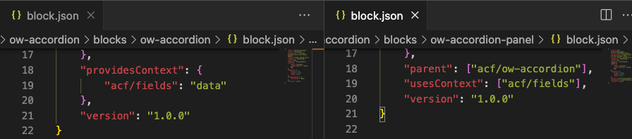
One of the main things that stood out to me as I was recording the last video was that the heading level was going to be the same for each of those accordion items. So instead of having to remember to set that same heading level on every single one, it was going to make a lot more sense to set that value on the parent accordion block and reference it from each of those children panel blocks. It’s a pretty straightforward change.
If we take a look at the code in the parent block.json, I added the providesContext item, and the value is an array with acf/fields – the value for that is data. And in the child block.json I added the usesContext
item for acf/fields.
In the child block.php I adjusted the source of my heading variable. If we take a look at the top area where I have my comments, one of the variables available to us is the context variable and so that’s what we’re going to be using to get our heading level.
If we head over to our ACF field groups we can see that there’s now two of them. The accordion panel is the existing one except I’ve removed heading level from it and then we now have the new one called accordion wrapper that has our heading level in it. And there’s going to be the new export file available to you in the GitHub repo.
If we head back over to the code we can see we’re now utilizing a different variable for our heading level. It’s that context that I mentioned before.
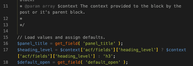
A couple things to mention here, I’m using the field name heading_level. There’s also the much longer random string of letters and numbers that ACF gives you that’s the actual field key instead of the name. The variable that I’m using isn’t going to be available to us until the page is saved so depending on your situation you might want to use the field key instead of the name. I need to set up a specific default anyway so I’m just checking to see if it exists and if it does then we’re using that heading level and if not we’re using the H3.
The second thing to mention is that when you’re adding fields to a parent block to use in the child, there are possible performance implications. Every single field that you have in that parent is going to get sent to every single child that you add to it so just be careful how you use it. Make sure you’re paying attention to performance, make sure you’re paying attention to the amount of fields that you add and just testing as you go.
I’ve also made a couple of improvements to the block editor admin side of things.
We used to have the words Panel Title and so I’ve swapped that out to just the star instead. I’ve adjusted that right within the block.php for the panel block, where we used to have the words we now have the star if we’re on the admin. I’ve also added in that divider line between the consecutive block panels which helps with that editing experience to give you a little bit of that front-end feel while you’re editing in the block editor.
Sometimes with the block editor, when you’re doing custom things that don’t utilize the classes that it creates, you have to add some admin-only styles. Now, I could adjust this to use those styles that the block editor uses but the edit here is small and pretty straightforward. Now, because the styles are the same as the front end, I added it directly to the main CSS file. There are ways to include admin-only stylesheets but it didn’t seem necessary in this case.
And that’s it for the ux changes. If you have any other ideas for improvements or ways to make things better let me know!